Write up: WTD Atlantic, 2023
Last updated: Dec 29, 2024
I didn’t think a virtual conference could be so fun.
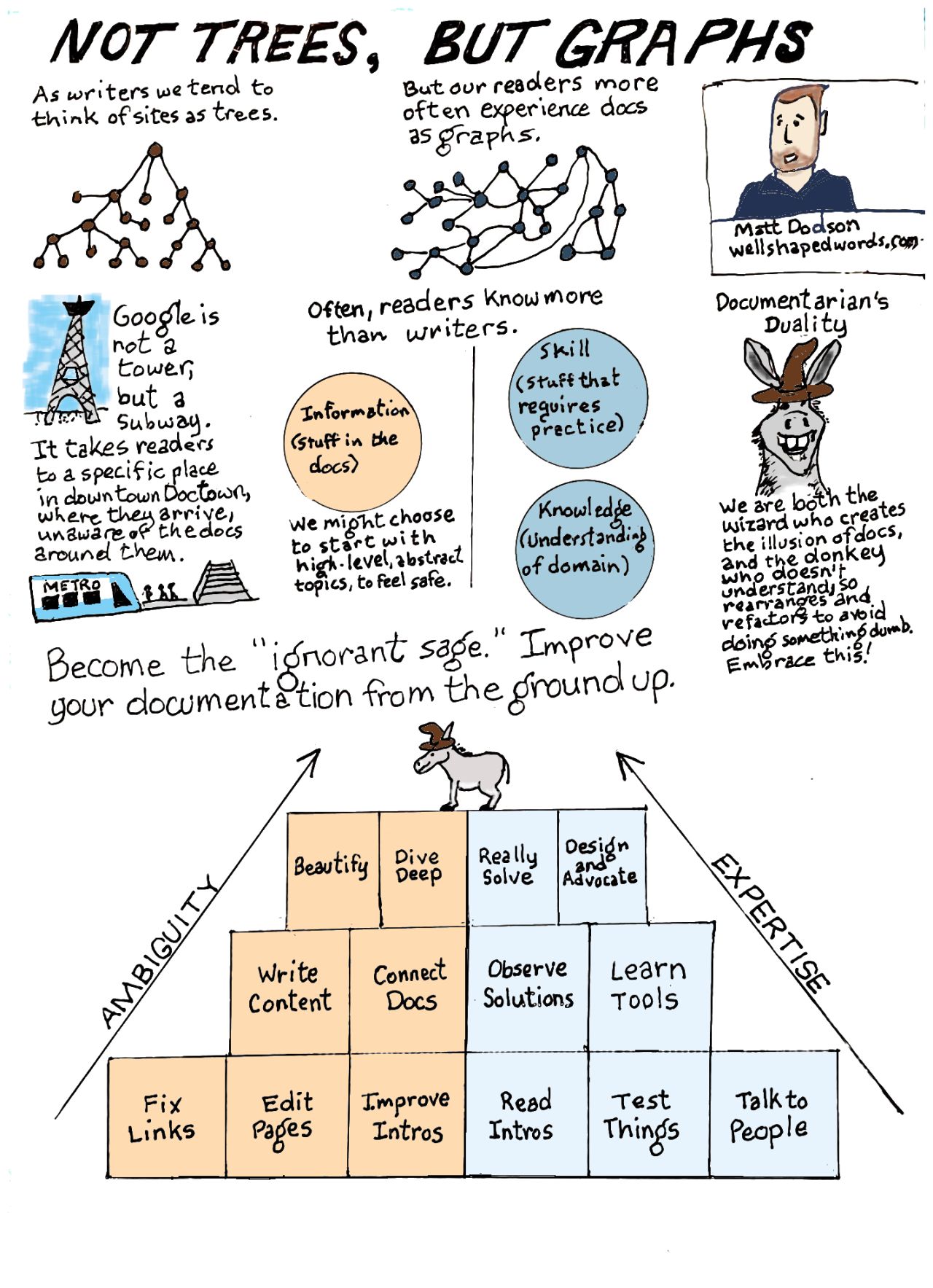
Earlier this month, I presented a talk at Write the Docs called “Graphs, not trees: a ground-up approach to fixing a docs site.”

Before I write up my thoughts, let me thank some people:
- Yesica Torrico for being the design brain behind the visuals, style, and overall organization
- Sviatoslav Abakumov for giving an incisive critique of a quite crappy first version.
I also thank the conference organizers, who did a great job curating talks and running a tight ship; the speakers, who all gave interesting talks; and of course the participants, who made this feel as interactive as an in-person conference. Through the chat, I really felt that the audience was an active participant in each talk.
Preparation
It started with an . I realized how inchoate my idea was only when I wrote the . Then the was accepted, and I thought what the hell did I write?
From here the process went through a few drafts, starting with a little storyboard and then an outlined script. The content of the images changed the content of the speech; for example, I originally used that man-donkey image only because it amused me, but after I referenced it a few more times, it became a through line of my whole narrative.
One month out, I recorded a loose, semi-improvised talk and requested feedback from my friend Sviatoslav. He pointed out a number of dead ends and faulty arguments. So I went back and wrote a script (ironically, now that I knew what I wanted to say, I used a trunk-and-branch approach to re-design my argument). Responding to this feedback made the presentation much tighter.
Tools
Effective communication does the most with its medium. Since the presentation was pre-recorded, my medium involved not only voice and image but also moving tracks that can be layered, edited, and re-watched. My original dream had animation and multi-track audio and video, all disciplines I know nothing about—even just making suitable audio was above me—and soon I hauled that dream away. 1
I do think the RevealJS medium gave me some flexibility to animate and make transitions that worked with the content.
To control the slides, I used KDE connect.
Presentations
The best part of the presentation was the live chat. I was pumped up!
All the talks were great. My only complaint is that there were too many good choices.
I also enjoyed the format of the parallel unconference sessions. I liked to speedily cycle through the rooms, a unique benefit of virtual conferences. The equivalent in real life would be to constantly barge into new rooms, listen for five seconds, leave, then return five minutes later to pop my head in for another five seconds.
Lessons
I’d never done a talk like this before. If I could do it over, I’d try to get a good recording environment before I did anything else. I underestimated how hard it is to get good lighting and sound, and by the time I recorded, it was too late to change environments. I also realized I had a lot of “ums” and “kind of, like, you know, a sort of…”, all noise that obscures the signal.
More advice for my past self:
- Don’t underestimate how hard it is to learn a new technology. RevealJS, audio, and video all presented new challenges (especially the latter two).
- Get feedback from multiple perspectives.
- Get feedback on an early, rough form. More polished versions might limit ideas.
- Rewrite and practice—but leave room for improvisation.
- Let the material dictate the story.
- Start with the story, then the images, then rework the story. Add all the little finishing details at the end. Words are way easier to change than images.
Pretty bland and generic, to be honest. I think I knew all this before I did the presentation, but now I really know.
Wrap up
I had never attended a professional conference, and I wasn’t expecting much from the virtual format. But the process ended up being wonderfully interactive, and there were so many smart ideas.
This was probably the most fun moment of my technical-writing career.
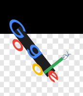
For the line “Google is not a tower, it’s a subway”, I spent hours animating the Google logo to look like a train. After watching multiple times to understand what I was trying to represent, my designer colleague asked why I was showing a freight train when I’m talking about a subway.

Besides looking terrible, this “Google subway train” would give everyone in the station carbon-monoxide poisoning.
